Advanced Watercolor Landscape Using Tonal Color and Loose Washes
An advanced watercolor coastal landscape created with loose washes, tonal color, and value-driven decisions. A painterly approach that embraces uncertainty and expression.
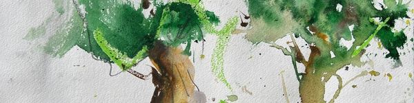
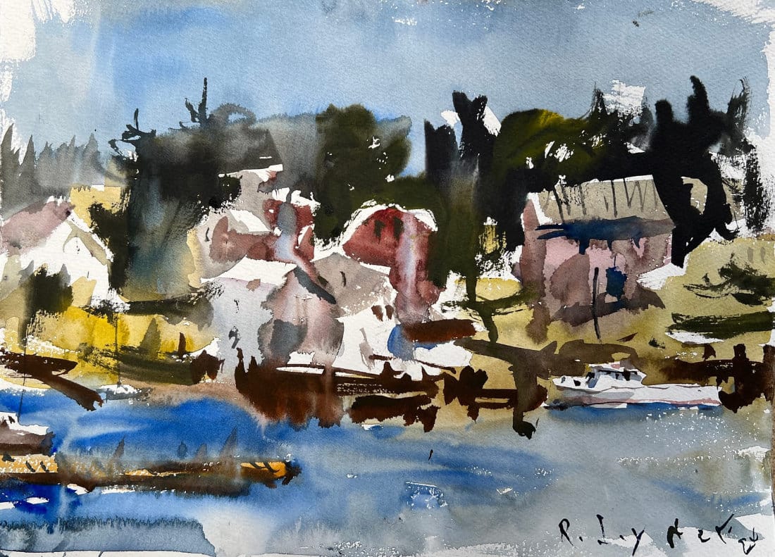
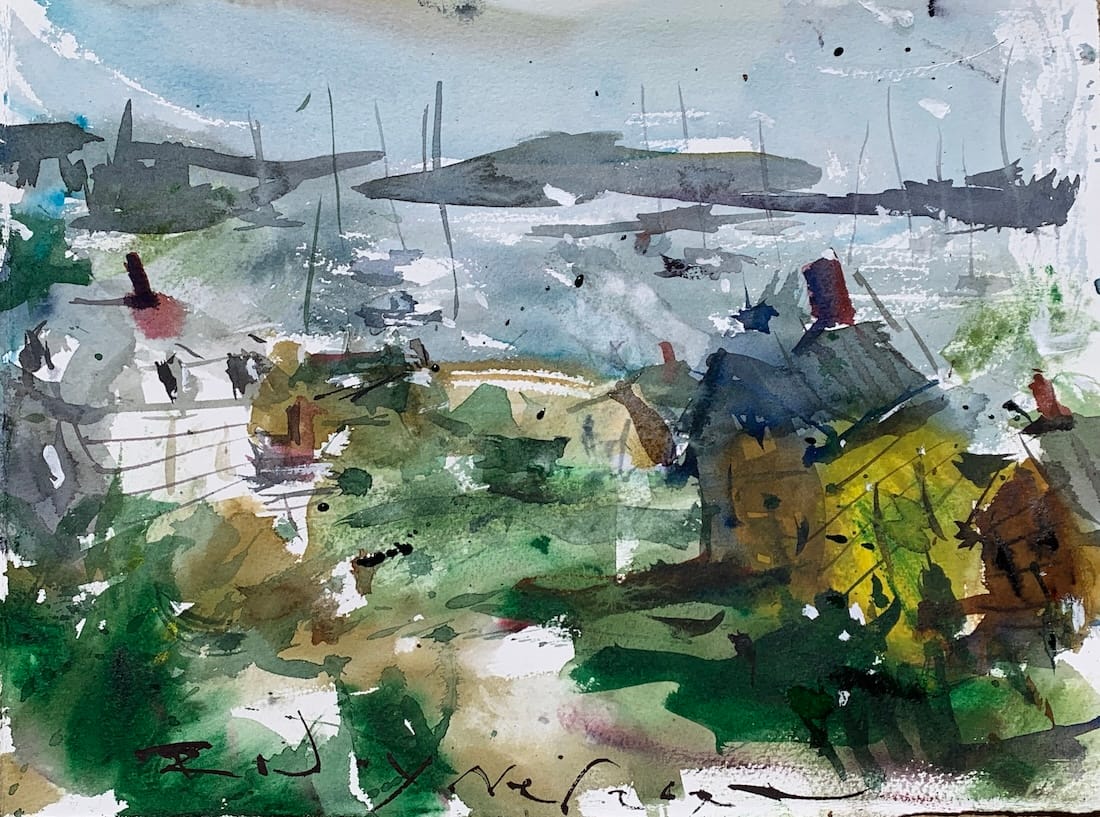
This advanced watercolor coastal landscape leans into loose washes, value control, and letting the paint make the first move. There’s no drawing here. I start straight in with washes and allow the watercolor to decide much of the direction early on. That uncertainty is part of the process and part of the payoff.
If you want a structured path instead of piecing things together, I’ve bundled all my watercolor lessons into one place.
The goal with this piece was to create a painterly coastal scene that feels atmospheric rather than literal. A few buildings, some water, hints of boats, but nothing spelled out. I want the viewer to fill in the blanks.
No Fear Watercolor Landscape Course
Learn how to paint loose, expressive watercolor landscapes with a clear structure. A step-by-step system designed to help you simplify complex scenery and create with confidence.
Starting Without a Drawing
Skipping the pencil sketch forces quicker decisions and keeps things loose. I begin with the sky and water planes, then move into the foreground using more saturated color. Early contrast helps establish direction before everything starts to mingle.
Tonal vs Chromatic Thinking
Rather than chasing lots of bright color, this painting leans tonal. That means quieter, desaturated colors dominate, with just a few saturated accents to keep things alive. I think more in values than in color names, focusing on light and dark relationships instead of exact hues.
Letting Washes Do the Work
Hairdryers, paper towels, lifting paint, and soft edges all play a role here. Watercolor naturally loses intensity as it dries, so knowing that ahead of time helps guide color choices. I’m constantly adjusting, removing paint, and simplifying shapes as the painting develops.
Editing as You Go
Details are suggested, not described. A vertical line becomes a boat. A few dark marks hint at buildings. If something doesn’t work, I remove it and keep going. This approach has a low success rate, but when it works, the results feel more alive and expressive.
Recommended Watercolor Materials
-
Holbein Professional Watercolor Paints – 8 Essential Hues
Yellow Ochre, Cadmium Lemon Yellow, Ultramarine Blue, Cerulean Blue, Alizarin Crimson, Cadmium Red Light, Neutral Tint, Burnt Sienna -
Fabriano Artistico Watercolor Paper – 140lb Cold Press
Buy full sheets and cut into quarter sheets for best value -
Silver Jumbo Wash Brush
Great coverage, excellent quality for the price -
Princeton Neptune Point Rounds (No. 12 & 6)
Reliable and affordable detail & wash brushes -
Princeton Neptune Dagger (1/2")
Versatile size for lines, edges, and detail work -
Masterson Aqua Pro Palette
Durable, with deep wells for generous mixing space -
Gator Board
Lightweight, long-lasting painting support board -
Holbein White Gouache
Optional for highlights and fine details - Miscellaneous: plastic water containers, paper towels, masking tape
This post contains affiliate links. If you make a purchase through these links, I may earn a commission at no extra cost to you.