How to Mix Watercolor the Right Way
Before you can throw caution to the wind with loose watercolor, you’ve got to nerd out on the basics. This 6-color split primary palette guide shows how solid fundamentals unlock expressive freedom.

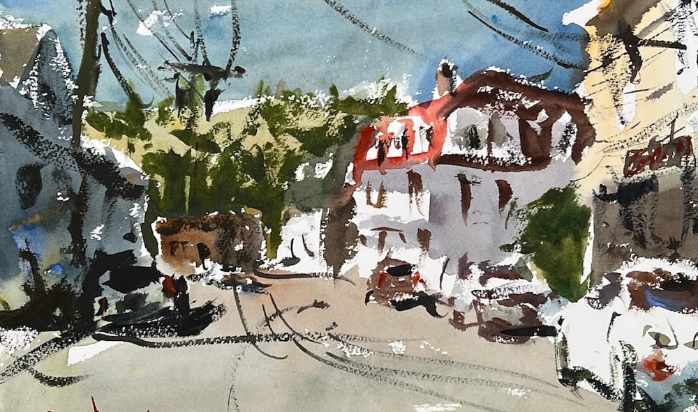
Hey, before we dive into mixing watercolor and exploring the Six Primary Palette, let me say this: if you’ve been around this site for a while, you know it’s all about painting loose and expressive, throwing caution to the wind, and finding freedom in your art.
But here’s the truth — none of that happens without some fundamentals. Early in my journey, I realized my paintings were falling apart because I was ignoring the basics. At some point, I had to knuckle down and learn the “nerdy stuff”: color mixing, values, composition, and all the technical skills that give you control.
It wasn’t glamorous, but it changed everything. Once I had those essentials in place, I finally had the confidence and permission to paint the way I wanted — loose, raw, and expressive.
So, today we’re going to nerd out a bit on color mixing. Throughout this site you’ll find plenty of skill-building tutorials like this one, because I believe strong fundamentals don’t limit you — they unlock your freedom.
Stop Fighting Watercolor
Watercolor isn’t about control—it’s about understanding. This bundle shows you how to loosen up, simplify your approach, and finally enjoy the process. No stiffness. No overthinking. Just better paintings.
The Six Primary Palette
Grade school lied - you need six primaries, not three. Why? Because not every blue and yellow make a good green.
Warm vs. Cool:
- Yellows: Yellow ochre (warm, has red), Cad yellow lemon (cool)
- Reds: Cad red light (warm), Alizarin crimson (cool, has blue)
- Blues: Ultramarine (warm, has red), Cerulean (cool)
Mixing Secondary Colors
Use warm + warm or cool + cool for clean secondaries:
- Orange: Yellow ochre + Cad red light (both warm)
- Violet: Alizarin crimson + Ultramarine (cool red + warm blue)
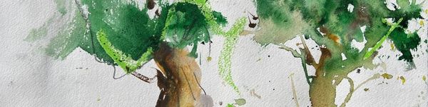
- Green: Cerulean + Cad yellow lemon (both cool)
What Happens When You Mix Wrong
Ultramarine + Yellow ochre = muddy gray (not a good green) Cad red light + Ultramarine = another gray (not violet)
Wrong combos make mud. Right combos make clean, vibrant color.
Tertiary Colors
Colors between primaries and secondaries. Just push your base mix with more of one color:
- Yellow-orange: Base orange + more yellow
- Red-orange: Base orange + more red
- Red-violet: Base violet + more alizarin
- Blue-violet: Base violet + more ultramarine
- Blue-green (turquoise): Base green + more cerulean
- Yellow-green: Base green + more cad yellow lemon
Key Takeaways
- Six primaries give you clean color mixing
- Match temperatures: warm + warm, cool + cool
- Wrong combos = mud, right combos = vibrant hues
- Leave gaps between colors on your palette so they don't mingle
Practice Exercise
Create a color wheel using the six primary palette. Mix all secondaries and tertiaries. Then try a "bad" mix (like ultramarine + yellow ochre) to see the difference.
Materials You’ll Need
Here are the materials I use all the time and have for decades. I only buy from Blick Art but feel free to shop where you prefer.
Recommended Watercolor Materials
-
Holbein Professional Watercolor Paints – 8 Essential Hues
Yellow Ochre, Cadmium Lemon Yellow, Ultramarine Blue, Cerulean Blue, Alizarin Crimson, Cadmium Red Light, Neutral Tint, Burnt Sienna -
Fabriano Artistico Watercolor Paper – 140lb Cold Press
Buy full sheets and cut into quarter sheets for best value -
Silver Jumbo Wash Brush
Great coverage, excellent quality for the price -
Princeton Neptune Point Rounds (No. 12 & 6)
Reliable and affordable detail & wash brushes -
Princeton Neptune Dagger (1/2")
Versatile size for lines, edges, and detail work -
Masterson Aqua Pro Palette
Durable, with deep wells for generous mixing space -
Gator Board
Lightweight, long-lasting painting support board -
Holbein White Gouache
Optional for highlights and fine details - Miscellaneous: plastic water containers, paper towels, masking tape
This post contains affiliate links. If you make a purchase through these links, I may earn a commission at no extra cost to you.